1. What do we mean by legibility?
Broad definition
When I mentioned to a couple of people that I intended to write a text on legibility they asked ‘legibility of what?’ The answer is legibility of text, but the question may have been looking for a more specific focus, i.e. what type of texts. The question also encouraged me to reflect on a more general interpretation of legibility. For example, the phrase from a dictionary which illustrates another use: ‘an anxious mood that was clearly legible upon her face’ shows that we read people’s facial expressions and interpret their mood from these. Although it may be intriguing to read faces, I intend to focus on reading text, and in particular ease of reading.
Within typographic and graphic design, we might consider whether signs are legible (in particular from a distance), whether we can decipher small print (especially later in life), if icons can be easily identified or recognised (without text labels), if a novel or textbook is set in a readable type (encouraging us to read on). These questions emphasise that it is not only the physical characteristics of the text or symbol that need to be considered in determining whether or not the designs are legible, or how legible they are. The purpose for reading, the context of reading, and the characteristics of the reader also determine legibility.
Question: Is legibility a binary concept (i.e. legible or illegible) or are there degrees of legibility, and perhaps also illegibility? If there are degrees, how do we decide what is an acceptable level of legibility? (We will return to this question in the final chapter.)
In describing various examples of designed objects, I have used adjectives other than ‘legible’ to describe the ease of reading, e.g. being identifiable, recognisable, or readable. These terms may be helpful in conveying the general meaning of legibility but there are circumstances where it is important to differentiate among them, and to be more precise in our definition. For example, when evaluating research, it is necessary to know what operational definition of legibility has been used by the researchers. An operational definition describes what is measured in the study (see Chapter 4).
Legibility, readability, and related concepts
Another way of considering what is meant by legibility is to distinguish it from related concepts. Starting with the initial sensation of an image on our retina, part of our eye (see Figure 2.2, Chapter 2), for this image to register, it must be ‘visible’ or ‘perceptible’. If it is too far away, for example, it will not be perceptible. We may therefore consider visibility or perceptibility as a prerequisite for legibility: if something is not visible, it cannot be legible. It may not always be possible to make a clear distinction between where perceptibility stops and legibility begins and this will become clearer when reviewing the methods used to test legibility (Chapter 4: Threshold and related measures. I will therefore include perceptibility as part of legibility.
Another distinction can be made between legibility and readability. Some authors, notably typographer, writer, and designer Walter Tracy, make the point that legibility and readability of type are separate attributes: legibility refers to the clarity of individual characters; readability refers to the ease with which we comprehend a text (Tracy 1986, p31). Unfortunately this definition of readability can be rather confusing as comprehension is influenced by typographic form, but also the complexity of the content affects our understanding of a text. For this reason, I am going to use a single concept, ‘legibility’, which will cover:
identifying individual characters, whole words, and reading text which will usually refer to continuous texts for extended reading, typically sentences arranged into paragraphs and sections.
This book is a good example of continuous text, although it is interrupted by other text elements (e.g. lists) and illustrations. I think it is too ambitious to expand the scope of this book to non-continuous texts, such as tables, signs, and forms, but I will mention signs from time-to-time.
I consider it important to update our definition of legibility to take into account that we frequently read from screens. Text can be read in print or on screen and usability may be a better way of describing the ease of working with print or screen documents, which may be affected by the layout or interface design. The term usability typically incorporates navigation and other forms of interaction with the text, as well as reading. Although I am focusing primarily on reading text and legibility, there may be some overlap with usability. The important point is to clarify what is measured in a study, rather than the particular word used by the researchers as these may differ.
Question: Which design variables might influence the legibility of this book?
By offering a fairly loose, and rather general, description of legibility, I wish to avoid getting too involved in analysing differences among definitions. Instead, we might consider how definitions highlight various characteristics or criteria and contribute to a fuller description which encompasses how legibility is measured and the context of reading. Panel 1.1 introduces several definitions from different sources, and I will return to some of these in later chapters.
Why is legibility important?
Legibility focuses the designer on the functional characteristics of a text to make a message accessible. There has been some opposition to legibility research, or even prioritising functionality, but this tends to be criticism of the methods used, and consequently what is measured (discussed further in Chapter 3 and 4). When the purpose is to convey a message, one of the roles of typography is to support reading.
Legibility is one aspect of universal or inclusive design, which is designing to meet the needs of people of diverse age and capability. In the UK, the British Standards Institute introduced a standard in 2005 and defined inclusive design as:
The design of mainstream products and/or services that is accessible to, and usable by, people with the widest range of abilities within the widest range of situations without the need for special adaptation or design.
British Standards Institution (2005, p4)
By designing legible material, we are supporting the ability of people to complete activities and tasks. The Web Accessibility Initiative explains the close relationship between accessibility, usability, and inclusive design.
Functionality versus aesthetics
A classic lecture given by Beatrice Warde in 1930 presents the case for ‘invisible type’, meaning the reader should not notice the characteristics of the type (Warde, 1930 in Armstrong, 2009, p41) as these may detract from communicating the message. This ideal appears to be in opposition to aesthetic considerations, if we interpret aesthetics as the creation of a beautiful text which draws attention to the typography. However, an alternative proposition is that legible text is also aesthetically pleasing. Therefore, legibility and aesthetics need not be seen as opposing aims in the design of continuous text.
…all designing — whether a car, a coffee pot, or a typeface — is a process in which two aspects should combine and balance: the object must work well, and it must look well.
Tracy replying to Donald E. Knuth's article “The concept of a meta-font”, (1982, p355)
Another view of the relationship between functionality and aesthetics is that typefaces have both these roles: a functional role relating to legibility; and an aesthetic or semantic role which determines whether the typeface is suitable for certain purposes because of the meaning conveyed by the visual form. This second role has been described using different terms: atmosphere value, congeniality, semantic qualities, and personality. More recently research has extended beyond typefaces to look at impressions gained from different typographic layouts, and ‘interaction aesthetics’ which are emotions emerging from interacting with products.
Question: Are there some objects or systems created by graphic designers where aesthetic considerations may be more important than legibility?
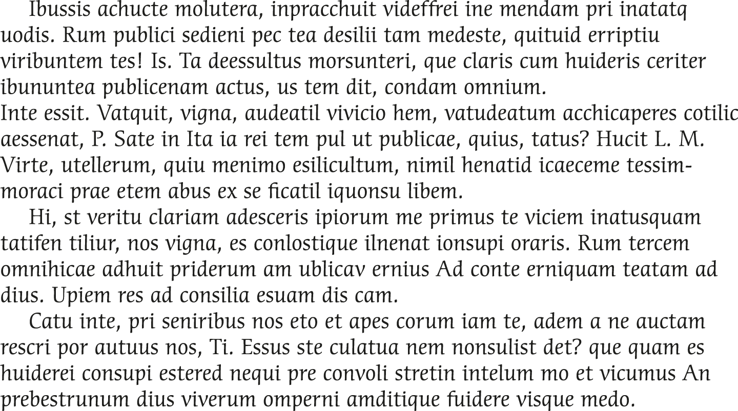
Exercise: rank the three examples (Figures 1.1A, 1.1B, 1.1C) according to your judgement of their legibility with 1 the most legible and 3 the least legible. Now rank the same three examples according to your aesthetic judgement with 1 the most pleasing.

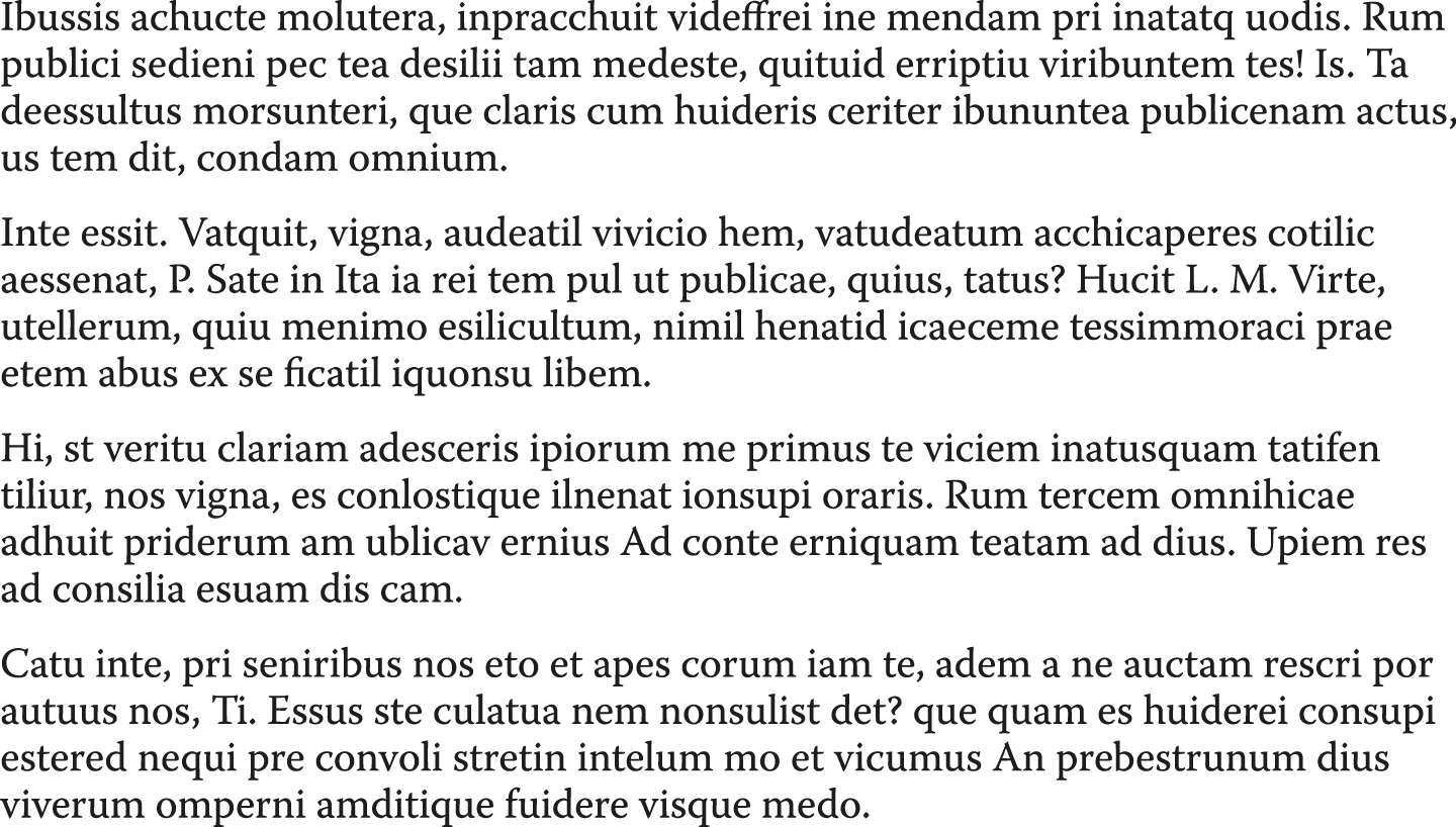
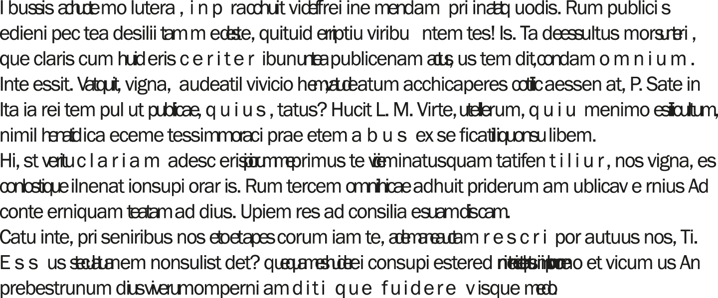
You may find that your judgements of legibility coincide with your judgements of what is the most aesthetically pleasing.
Now do the same set of two rankings for these 3: Figures 1.2A, 1.2B, 1.2C.
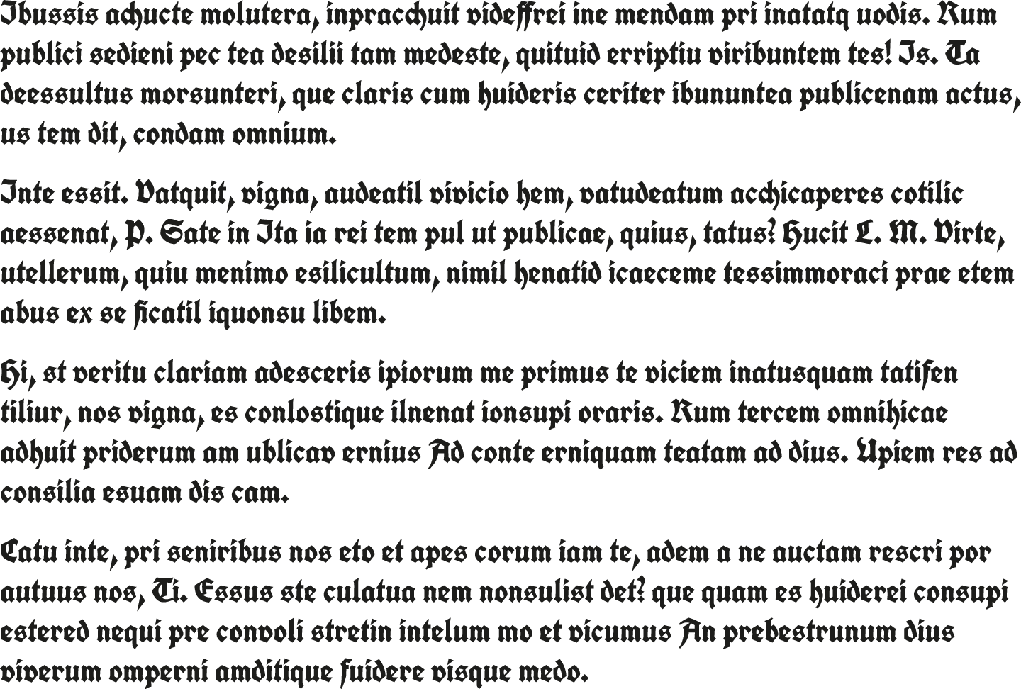

I have included this second set of examples to demonstrate that legibility and aesthetics may not always coincide. This may seem to contradict my proposition above, but I include it to illustrate that demonstrations can be quite convincing, until a counter example is provided that is equally convincing.
Evidence for legibility
It is therefore important to be critical of evidence that supports particular positions. We should question what the evidence is and how it was obtained. In the exercise above, you used your experience to make judgements about legibility. These judgements are useful and sometimes form part of legibility research.
An issue for discussion is whether designers can make claims concerning legibility if they have no means of supporting their claim other than their own judgement. I do not underestimate the value of professional knowledge, craft experience, or practical design skills and training. However, at the very least, I believe it is important to check that we have not developed less than optimal ways of presenting text which may be based on misguided notions of what readers find easiest to read.
Question: In your opinion, what contribution can designers’ judgements make to determining what is most legible?
In this text I am going to focus on empirical research, commonly studies testing different typographical arrangements on a group of participants. Most of the research is based on adult reading but occasionally I describe some studies which include children because the typography may need to be different to cater for the developing reader.
Summary
When applied to reading, legibility has been described in many ways and there are disagreements about:
-
whether or not it should apply only to individual characters
-
how it is distinguished from readability (or other related terms)
-
its relationship with aesthetics
-
how relevant legibility research is to practice
If you are informed about the legibility research that has been done, why it has been done, how it has been done, and what the outcomes are, you are in a position to evaluate its contribution to your design thinking and practice. I therefore encourage you to read on.