2. How we read
Rationale
You may question why it is necessary for graphic or typographic designers to know about the mechanics of reading, which would seem to be the responsibility of scientists, particularly psychologists. In order to know what makes a text more legible, we could limit ourselves to finding out about the results of specific legibility studies. But to understand why something may be harder to read, we need to have some knowledge of how we read, in particular the early visual perceptual processes in reading. This stage of identifying letters and words has been described as the perceptual processes of pattern recognition, and this is where design decisions (determining the visual characteristics of letters or lines of text on a page or screen) can have an effect. The written word has been described as a visual object and a linguistic entity (Grainger, 2016). Designers may not be so concerned about the linguistic entity but considering words as visual objects seems key to the role of a typographer or graphic designer. As a psychologist, I am interested in how specific typographic variables affect how we read. I believe this is also very useful information for designers.
Eye movements
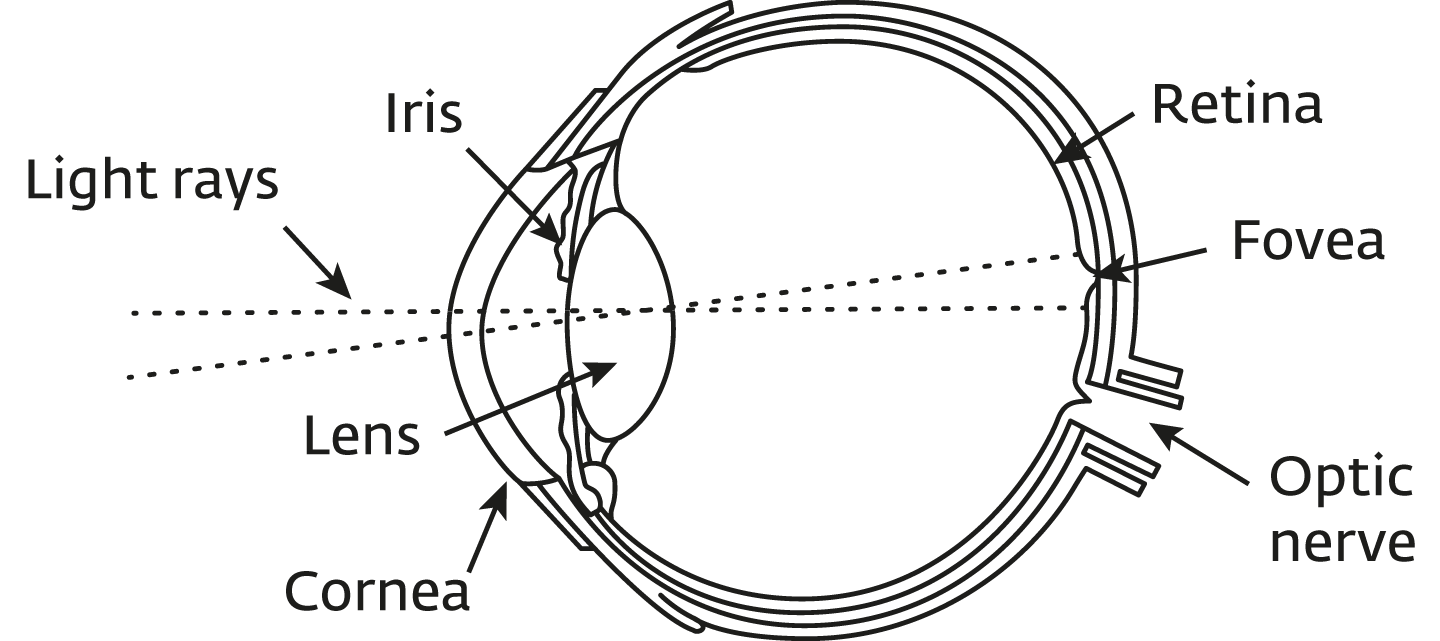
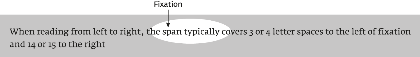
A lot of our knowledge of the reading process comes from studies of eye movements. Our eyes do not move along lines of text in a smooth gradual way. Instead, our eyes make ‘saccades’, which are very quick jumps from one point to another, typically jumping 7 to 9 letters (Figure 2.1). During these movements we have no vision; the vision takes place in the pauses or fixations between saccades. These tend to last about 200 to 250 msecs (a quarter of a second). The time spent in pauses is about 90% of the time. When we get to the end of a line, we make a return sweep to the beginning (or close to the beginning) of the next line. If we do not read something properly, we make a ‘regression’ which is where we go back to an earlier point. When we make these saccades, we position our eyes so that part of the text falls on the area of maximum acuity on our retina; this area is called the fovea (see Figure 2.2). At normal reading distances about 6 or 7 letters fall onto the fovea; adjacent to this is the parafovea and peripheral vision. We have an area of effective vision during a fixation, sometimes referred to as the ‘perceptual span’, and we make use of letters surrounding the 6 or 7 letters. When reading from left to right, the span typically covers 3 or 4 letter spaces to the left of fixation and 14 or 15 to the right (see Figure 2.3). However, this is not fixed as, for example, beginning readers have a smaller span and text difficulty reduces the span (Rayner, 1986).
Question: Why might studies of eye movements be a good way of finding out how we read? Are we able to report on our own reading?
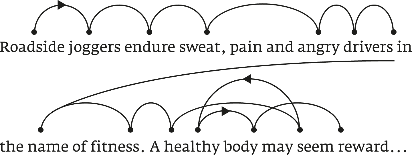
Figure 2.1: A typical pattern of eye movements indicating where on a word our eye fixates (black dots, usually towards the beginning of a word), the length of saccades (jumps), the return sweep from near the end of the first line to near the beginning of the next, and a regression back to the word ‘healthy’ followed by an additional fixation on ‘body’. Diagram based on Larson (2004) and Rayner and Pollatsek (1989, p116).
How do we recognise words?
There is broad agreement amongst reading researchers that word recognition is letter-based. What we are doing in the pauses or fixations is identifying letters and these are combined into words.
Word shape re-examined
However, many texts on typography refer to the use of word shape information, suggesting that we recognise words from their outline shape, e.g. the pattern of ascenders and descenders (see Figure 2.4). This comes from an outdated model, originally proposed in 1886 by a psychologist, James Cattell. Classic texts connected with legibility include references to word shape, as this was probably the current, or reasonably current, thinking based on psychological literature at the time of publication. Spencer wrote: ‘Perception in normal reading is by word wholes…’ (Spencer, 1968, p20). Unfortunately, this view is perpetuated in more recently published literature making it important that we critically evaluate what we read.

At an Association Typographique Internationale conference in September 2003, Kevin Larson (a reading psychologist working in Microsoft Corporation’s Advanced Reading Technology Group) spoke of the significant discrepancy between recent psychological models of reading (supported by evidence) and typographers’ beliefs and understanding. Panel 2.1 based on Larson (2004), explains where the support for word shape came from.
Question: Why do you think the belief that word shape is important in reading persisted for a long time and is still held by some people?
Exercise: Take the jumbled paragraph:
Aoccdrnig to a rscheearer at Cmabrigde Uinervtisy, it deosn’t mttaer in waht oredr the ltteers in a wrod are, the olny iprmoetnt tihng is taht the frist and lsat ltteer be at the rghit pclae. The rset can be a toatl mses and you can sitll raed it wouthit porbelm. Tihs is bcuseae the huamn mnid deos not raed ervey lteter by istlef, but the wrod as a wlohe.
Can you re-arrange each word so that it becomes problematic to read trying not to move a lot more letters than in the original jumble? Is it still possible to read some words if the beginning and end letters are transposed?
Parallel letter recognition
As skilled readers, we identify individual letters in parallel (simultaneously) rather than sequentially (one after the other). We therefore need to not only work out what the letters are but also their order within words, using word spaces to identify the word boundaries. This information is used to match against stored words to derive meaning and/or sound (pronunciation). See Panel 2.2 for a distinction between silent reading and reading aloud.
The space between letters is also important as letters are less visible when surrounded by other letters. This is referred to as ‘crowding’, and is not specific to letters. The effect of crowding is greater in our peripheral vision, which means we are less able to recognise words further from the fovea. This is due to reduced visual acuity and crowding. Words are recognised from their parts (i.e. letters) and crowding reduces our ability to identify the individual letters as the adjacent letters jumble their appearance.
This also happens with faces. If we look at a face using our peripheral vision, it may be difficult to work out if the person is frowning or smiling. The context of the face hinders our perception. If the mouth alone were shown to us in peripheral vision, without the face context, it would be easier to work out if it was a frown or smile. If we look at someone using our central vision (in front of us), having the whole face is an advantage. Box 2.1 describes the research and hopefully demonstrates this effect.
Word context
A large amount of research into how we read has used isolated letters and words that are not in the context of sentences. These studies might therefore be criticised for using artificial test material which does not reflect ‘normal reading’. (Chapter 4 will discuss the reasons for the choice of methods in more detail). We usually read words in sentences and this context can help us to predict what word may follow. The description of crowding above has also shown that context can have a negative effect (in peripheral vision). A psychological study has looked at the relative contribution of letters, words, and sentence context to how fast we read (Pelli and Tillman, 2007). They found that letters contribute most to reading rate (62%); words contribute only 16% and sentence context contributes the remaining 22%. Word shape therefore plays a very small part in reading. The research is described in Box 2.2.
Question: How easily can you read the following? Why is this more difficult than the demonstration in Panel 2.1 from the text circulating on the Internet? (Reading Box 2.2 may help)
That and frist word Uinervtisy at the ltteers thing rscheearer pclae to are a the is mttaer Cmabrigde aoccdrnig it in lsat the deosn’t oredr olny what ltteer rghit iprmoetnt at what be a.
Question: Which of Figures 2.6a, 2.6b, 2.6c looks hardest to read and understand? Which looks easiest?
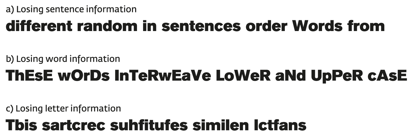
Did you think that losing letter information (c) made reading hardest and losing word information (b) was easiest to read? If so, your answers correspond to the results of Pelli and Tillman.
Identification of letter features
Given the importance of identifying letters, quite a lot of research has looked into what features of letters we use to distinguish one letter from another. However, models of reading have assumed that the particular font will not affect the basic results (McClelland and Rumelhart, 1981, p383). Many models use a font with straight-line segments, created by Rumelhart and Siple (1974) which disregards typical letter shapes (see Figure 2.7). However, there is now a greater focus on letter perception by psychologists which must be good for typographers. The outcomes of these studies are described in Chapter 5 and Chapter 6 where they are combined with research from a design perspective.

Figure 2.7: Font used to create words in Rumelhart and Siple (1974) and still used in models of reading.
Reading different typefaces and handwriting
The research on letter features looks for characteristics that are
shared by any letter a and letter b etc., such as mid segments or
stroke terminals (see Chapter 5: Letter features). A skilled reader can
recognise most letters quickly regardless of the visual form, which can
mean the font, case (capital letters and small letters), or style of
handwriting.
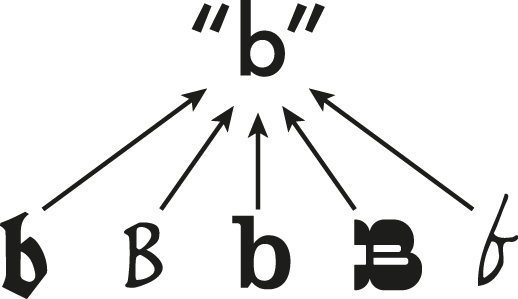
b even though it can take many
shapes and sizes.Despite these differences in the visual forms of the same letter, we can
easily identify letters, recognising them as representing the same
character. We are creating abstract letter identities (Grainger, Rey and Dufau, 2008), where the letter is identified as a or b irrespective
of font, size or case (Besner, Coltheart and Davelaar, 1984). Figure 2.8
illustrates this mapping of different forms onto a single
representation. How we do this, and identify letters despite their
different forms, was proposed by a psychologist about 30 years ago
(Sanocki, 1987, 1988). He referred to this as ‘font tuning’.
It is often assumed that once we have converted to an abstract letter identity, we no longer retain knowledge of the visual form, because this is not essential to reading. Some exceptions to this are when we wish to:
-
identify the typeface (something that typographic and graphic designers may wish to do)
-
recognise whose handwriting we are looking at
-
identify brand names and corporate identities
Panel 2.3 provides a little more detail of font tuning and research which looks at how we recognise letters using neuroscience techniques.
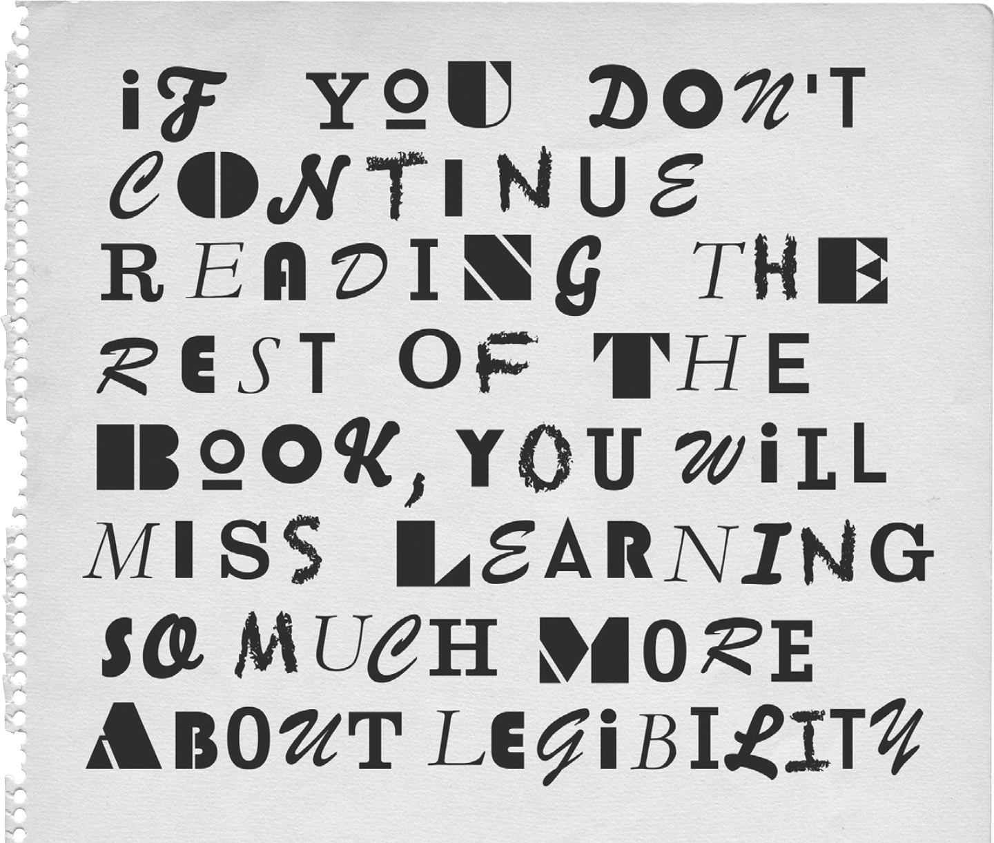
Questions: why is handwriting usually harder to read than print, based on what you have learned about how we read? Think about (i) individual characters; (ii) relationship between different characters.
Here’s a clue: Why might a ransom note be more difficult to read than normal text? (Figure 2.9)
Summary
Typographers and graphic designers were led to believe that we read by identifying words from their outline shape. This was once the view held by psychologists, but research improves our understanding and it is important to update our knowledge. We know a lot about reading from:
-
monitoring eye movements
-
using sophisticated techniques to see which parts of letters we use to differentiate letters
-
working out how sentence and word information contribute in positive (providing context) or negative (crowding) ways
There is a greater interest developing among scientists in looking at different visual forms, not just assuming all letters are equal so the font or case doesn’t matter. Recent psychological research is demonstrating a greater sensitivity to typography which will be of great benefit to designers. This is described further in the next chapter.