7. Beyond legibility research
Broadening the scope
This book started with a broad definition of legibility and deliberately avoided constraining the definition to the clarity of individual characters. Taking this approach has given me the freedom to write about typographic variables which may impact on legibility, readability, usability (or other related concepts). Nevertheless, the content of this book does reflect a rather traditional approach to legibility, i.e. studies from over 50 years ago, with some updating to include recent studies. There are also screen-based studies from over 30 years ago.
You may question the relevance of such old research to designing for print or screen today — I certainly do. My reasons to include older material are because the studies:
-
provide a means of comparison with more recent research, as some results may still be valid
-
create a framework for introducing newer studies, by identifying variables and methods
-
fill gaps as there isn’t yet a large body of research on the legibility of newer technologies such as mobile devices
I find a comparison of print and screen legibility of particular personal interest as my own research was underpinned by a belief that we shouldn’t simply apply what we know about designing for print to screen design. My view is that research on print legibility can both inform and constrain screen design. General principles such as consistency, ease of navigation, good legibility will apply to print and screen-based technologies. However, the particularities of the screen, how we interact with it, for what purposes (i.e. skimming, scanning, continuous reading), and our familiarity and comfort with its use will impact on legibility.
In this last chapter, I will explore:,
-
how familiarity might contribute to legibility
-
interacting with mobile devices
-
impressions of typographic material
-
a challenge to legibility
Familiarity revisited
As indicated in Chapter 4, typeface familiarity has been addressed directly by Beier and Larson (2013). They considered two perspectives proposing that familiarity is based on:
-
amount of exposure to the typeface; this coincides with Licko’s definition of legibility described in Panel 1.1: ‘You read best what you read most’
-
common letter shapes resulting in a prototype or skeleton for each letter; this can be identified by superimposing common typefaces to reveal the parts that are shared by the typefaces (see Figure 7.1)

Figure 7.1: Based on Frutiger (1998, p202) who superimposed the letter a in eight typefaces to demonstrate the skeleton form (darkest
area). Here the typefaces are Times, Palatino, Baskerville, Garamond,
Helvetica, Univers, Bodoni, and Minion.
The study aims to establish which of the two perspectives on familiarity affects reading speed and preferences. Fonts were designed with:
-
common letter shapes, matching the skeletons
-
uncommon letter shapes, different from the skeletons
Fonts were selected which are:
-
known to participants (through previous exposure)
-
unknown (i.e. new) to participants as they were designed for the study by Sofie Beier
The fonts used in the study are listed in Table 7.1. There is a blank cell in the table (uncommon letter shapes that are known fonts) because we don’t usually encounter fonts with uncommon letter shapes. You will see examples of the uncommon letters shapes in Spencer Neue and PykeText Neue in the bottom, right cell.
The study involves two short reading speed tests, separated by a longer (20 minute) session where short stories are read in the typeface being tested. Participants also answer questions about the reading experience after each reading speed test. More detail of the method is provided in Box 7.1.
The results do not give us a clear indication as to how familiarity might contribute to legibility. There is still some ambiguity as to whether the amount of exposure to a typeface is critical to legibility or common letter shapes. With all fonts, participants read more paragraphs in the post-test compared to the pre-test, meaning they read faster in the second test. This might be interpreted as support for the exposure explanation as the post-test came after reading more in the font. However, this could also be a practice effect as we are likely to be better at a task the second time we carry it out. The fonts with uncommon letter shapes (Spencer Neue and PykeTest Neue) were read as fast as the ones with common letter shapes (known and unknown).
The responses to questions did reveal that the uncommon letter shapes are not considered enjoyable for reading in the future, nor a comfortable reading experience, and cause participants to focus on the typeface. Although these negative perceptions are less strong after more exposure, they contrast with the positive responses to common letter shapes. These judgements therefore support the explanation that we desire the familiarity of letters which are close to the prototype or skeleton.
If we are guided by readers’ opinions, we will be conservative in our letterform design in case readers choose not to read typefaces which vary too much from those they have read before, even though they can be read efficiently. This disparity between subjective judgements of what is easy to read or preferred and how easily we actually read text occurs with line lengths on screen (see Chapter 6). If we are conditioned to perceive what we meet most often as easiest to read (common letter shapes or moderate line lengths) then repeated exposure to the less familiar may reduce the mismatch between our judgements and our performance. However, reader’s experiences with the less familiar need to be perceived in a more positive manner — a challenge for designers.
Question: If what people say they read best is not what they actually read best, which result would you use to inform your design? Can you think of any ways in which less familiar typographic treatments might be introduced?
Brief glances at text
The type of reading we engage in, and our use of mobile devices, has been addressed by a Clear Information Presentation Consortium which started with MIT (Massachusetts Institute of Technology) AgeLab collaborating with Monotype (font and technology specialists). They concern themselves with mobile computing and an initial study (Reimer, Mehler, Dobres, Coughlin, Metteson, Gould, Chahine and Levantovsky, 2014) used a driving simulator. They compare menu selection with two typefaces that are typical of those used in the car industry for vehicle displays: Eurostile and Frutiger (see Figure 7.2). A distinction is made between reading continuous text and the brief glances typical of reading displays when driving. Their study indicated that men look less often and spend less time glancing at menu text displays set in Frutiger compared to Eurostile. Women did not show this difference between the two typefaces. To explain this gender difference, the researchers speculate that there may be perceptual differences associated with gender or that women are more risk averse. The latter seems more probable as women tended to spend less time looking at the displays and therefore longer looking at the road (in the simulation).
Question: What is your interpretation of this gender difference?
Figure 7.2: Eurostile typeface (top) and Frutiger (bottom) used by Reimer et al. (2014) and Dobres et al. (2016).
A subsequent study by the same group abandoned the driving simulator and used a short exposure method (see Chapter 4 and Panel 4.3), adapting the display time for each participant and using a lexical decision task (Dobres, Chahine, Reimer, Gould, Mehler, and Coughlin, 2016). They found that Frutiger is more legible than Eurostile. Men and women show the same pattern of results when the effects of driving behaviour are removed. The previous results could therefore be explained by a difference in women’s approach to a task involving driving and not the unlikely explanation of perceptual differences. (See Panel 7.1 for comment on the change in method).
Navigation through different menu styles
Chapter 1 mentioned usability as a way of describing the ease of using print or screen material, whereas legibility involves reading. Usability therefore encompasses navigation and although the term was used in Chapter 6 to describe the use of headings in printed text, usability commonly refers to interacting with screen-based technologies.
A study which uses smartphones to compare different styles of menu design provides an example of a usability study with technology current in 2014. The study uses a 3.5 inch (8.89 cm, diagonal measurement) iPhone 4S, running iOS 7.1. This research was carried out for an undergraduate dissertation at the University of Reading, UK (Rudgard-Redsell, 2014). As the small screens of smartphones have fewer pixels available to display content and navigation tools, various different styles of menus have been built into operating systems. The study compared the four menu styles shown in Figure 7.3 and measured usability through the time taken to complete a task requiring navigation to various screens. This performance measure was compared with their subjective judgements of usability including:
-
perceived ease of use
-
perceived speed of use
-
preference for use
-
most often seen
-
aesthetic qualities
-
preferred style overall
The study described in Chapter 5, Box 5.2 compares actual and perceived legibility (how we read compared with our judgements). Here we are looking at a similar comparison of actual and perceived usability.
Figure 7.3: Four menu styles tested, from left to right: drop down, tab bar, side menu, grid view (Rudgard-Redsell, 2014).
The study found that the tab bar menu style is navigated fastest and also perceived as the fastest to use. However, the side menu is thought to be easier to use and more aesthetically pleasing. This suggests that the users placed greater emphasis on how much content can be shown on the small screen, rather than speed of navigation. With the side bar, when the menu is inactive, the menu only takes up the space of one button to show and hide menu options. The tab bar has menu options constantly visible on screen taking up more space.
The participants in the study were young undergraduate students at the University of Reading, and most regularly used social media apps. The author acknowledges that the results may have been different with less experienced users, but the results inform us that users don’t necessarily prefer the fastest method of navigation. Instead, they like a style they are comfortable with and consider aesthetically pleasing. Developing software that matches these preferences is an important aspect of user interface design and underlines the relationship between functionality (usability or legibility) and aesthetics (see Chapter 1).
Question: If you were designing an interface, what would you prioritise?
Aesthetics
Some recent work complements legibility research by allowing both functional and aesthetic dimensions or constructs to emerge from readers’ perceptions of documents. The research extends the studies of typeface semantics (described in Chapter 6) to look at the connotations of different typographic layouts. These incorporate stylistic variables (e.g. typeface and weight) and spatial or structural attributes (e.g. columns and use of white space) (Moys 2014a, 2014b). The approach taken reflects the multivariate nature of document design: considering the interplay among typographic variables. It also allows participants to comment on constructs which are relevant to them, rather than imposed by the researcher.
Based on a preliminary study, magazine layouts with three patterns of typographic differentiation (high, moderate, low) and controlled content were used to investigate participants’ impressions of documents. Figure 7.4 illustrates examples of the three typographic differentiation patterns. The key themes that emerge are:
-
references to the appearance of the documents (i.e. stylistic and structural attributes)
-
evaluative comments that refer to the appeal to particular readers
-
references to the kinds of content, publications, genres, etc.
-
appraisals of credibility or appropriateness
-
consideration of how readers experience and interact with documents, relating to usability and reading
a) high differentiation
b) moderate differentiation
c) low differentiation
The final theme relates to legibility and demonstrates that readers are sensitive to the way in which typographic layouts may hinder or support reading (Moys, 2014a). However, there is a broad range of impressions which enables us to consider how legibility or usability sits alongside evaluations of aesthetics, genre, and suitability for specific purposes. As indicated in Chapter 1, legibility should not focus solely on the physical characteristics of the text. Legibility is also determined by the purpose and context for reading and the characteristics of the reader. Participants perceive these many aspects relating to the typography of documents when able to use their own constructs.
The case against legibility | disfluency
In the last section of Chapter 6, I describe a study where a poor layout improves recall of content compared with a good layout when reading print, but not with an eInk device. The print result therefore contradicts the findings of legibility research whereas reading from an eInk device confirms the findings.
I already have one unanswered Question: why are the results different for print and eInk? A second question is why does a layout, which past research tells us is more difficult to read, help with recall. We should remember that the poor layout in both print and eInk did slow down reading, which fits with the results of legibility research.
A possible answer to the second question comes from some research which has looked at how the font used to present material can affect the fluency of processing the information (Song and Schwarz, 2010). One of their studies compared a description of an exercise routine in Arial with the same description in Brush (see Figure 7.5). Readers thought the exercise would take nearly twice as long when read in the more difficult-to-read font (Song and Schwarz, 2008). They misinterpreted the difficulty in reading as a difficulty in doing the exercise.
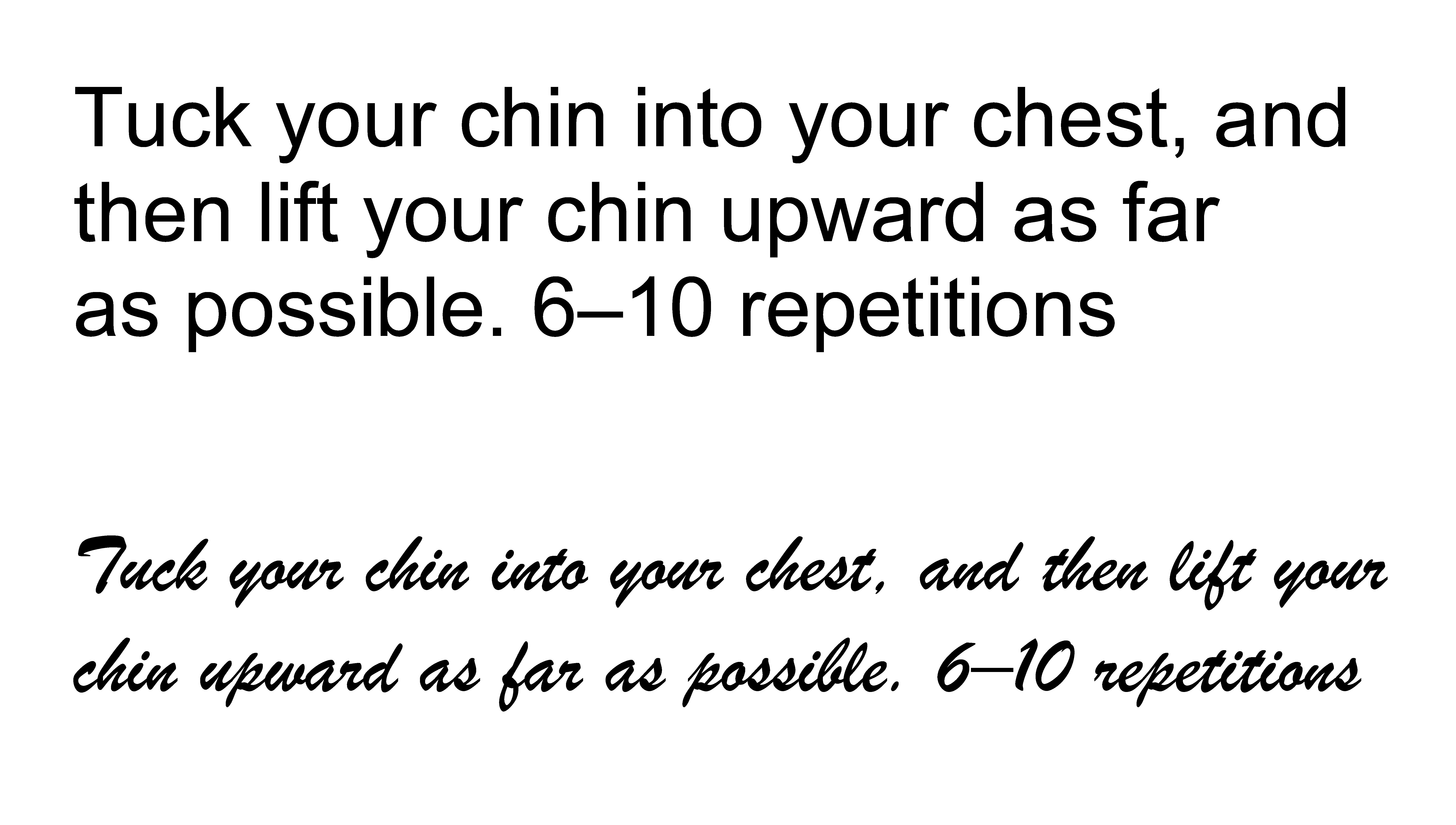
Figure 7.5: Part of the exercise description used by Song and Schwarz (2008) in Arial 12 point (top) and Brush 12 point (bottom), illustrated in Song and Schwarz (2010).
Another later study found that fonts which are harder to read improve learning (Diemand-Yauman, Oppenheimer, and Vaughan, 2011). The explanation is based on the concept of disfluency which refers to our metacognitive experience of ease or difficulty. In the context of learning, it is an awareness of the difficulty of reading less legible fonts and this is supposed to make us put more effort into the task. By putting in more effort, we process the text more thoroughly and therefore remember more. These researchers demonstrated the benefit of hard-to-read fonts in a memory task and in the real-life context of a classroom.
There are various problems with research on disfluency which are explored fully in Box 7.2. Whilst it is tempting to ignore this work, I think it is important to include here because:
-
one of my students found this curious result (Moys, Loveland, and Dyson, 2018)
-
the studies by Diemand-Yauman et al. (2011) receive a lot of attention: 541 citations and articles in popular press
-
studies which explore disfluency by using hard-to-read fonts, or other typographical variations, do not refer to legibility research; I think it is helpful to bring together these two fields of study
Perhaps because of the far-reaching implications of promoting disfluency, there have been various studies checking whether they can replicate the results. A lot of these studies have failed to find that making material harder to read improves recall or comprehension. This indicates that disfluency effects are not robust (repeatable) and efforts have been made to work out which characteristics might affect the results. Suggestions include:
-
learner characteristics (e.g. academic abilities, spatial abilities, prior knowledge, motivation)
-
task characteristics (e.g. task difficulty, self-paced versus paced reading)
-
material characteristics (e.g. how different is the hard-to-read version)
Despite these investigations, we don’t yet know the disfluent conditions which might help us remember what we have read. A fairly consistent result from these studies is that we are slower to read material that has been deliberately made harder to read. This is hardly a surprise and is essentially the same as the results of legibility research. I wouldn’t recommend using less legible material in your design practice as we don’t have good evidence that there is an improvement in retention or recall. Although disfluency may sometimes have positive benefits, communicators and educators are advised to present information in a form that facilitates easy processing, promoting legibility (Song and Schwarz, 2010, p111). Even Diemand-Yauman and colleagues warned us that there is a danger of moving from disfluent material to illegible material where it would hinder learning (Diemand-Yauman et al., 2011, p114).
Returning to the first question in Chapter 1, how would you answer this now?
Question: Is legibility a binary concept (i.e. legible or illegible) or are there degrees of legibility, and perhaps also illegibility? If there are degrees, how do we decide what is an acceptable level of legibility?
Conclusion
This last chapter has moved away from mainstream legibility but has hopefully provided an insight into related areas of research. Most of these can inform design practice but I would treat the concept of introducing disfluency with extreme caution. There are other ways to encourage readers to engage with text that do not make reading more difficult.
You may feel that it was unnecessary to read quite so much about psychological processes involved in reading or the detail of experiments. If so, I expect you have skipped over these parts or skimmed them. The book is designed to enable you to do this, to choose your own reading strategy. If you developed an interest in how we read and how research is carried out, I hope you will pursue this interest in the future. We need to update our research knowledge base to keep track with changes in screen-based technologies and different reading habits. As a typographic or graphic designer, you can make an invaluable contribution, especially if you are open to collaborating with other disciplines.