5. Overview of research: Type
Introduction
Legibility research up to about the 1980s explored printed material. Herbert Spencer who had written an overview of legibility research in 1968 commented soon after that legibility research needs to be about different forms of output and all media (Spencer, 1970, p73). I doubt he could have envisaged the current ubiquity of mobile phones and tablets, but he did realise that new issues would arise without the constraints of the printed page. Although some relatively recent studies have focused on print legibility (e.g. Lonsdale, 2006, 2007), investigations of reading from and interacting with screens are probably now the more common interests for legibility research.
In providing an overview of the outcomes of legibility research, I am starting with type (this chapter) and building up from there (chapter 6). Research using material presented on screens is discussed together with print, and comparisons made where relevant. Rather than simply summarise the results, I also include the context and objectives of the research because these can affect how we interpret the results and relate them to design practice. Although you may think that a clear set of guidelines and recommendations on how to design to optimise legibility may be more helpful, these would probably oversimplify and mislead. I think a better approach is to try to understand how and why typographic and graphic variables affect different aspects of reading to inform design decisions, rather than prescribe how to design. A set of guidelines based on research are available covering web design and usability.
Screen versus paper
A starting point for research into reading from screen was comparisons with paper; Dillon (1992; 2004, Chapter 3) reviews these studies. In a sense, these were legibility studies as they used measures such as speed of reading and the results usually indicated that reading from screen was slower. At the time, they were helpful in informing educators, but had limited practical application for designers looking for guidance on optimal legibility, unless they were deciding between using screen or print. The results have less relevance today as these older studies from the 1980s and 1990s used cathode ray tube (CRT) technology, now obsolete and replaced with thin film transistor liquid crystal displays (TFT-LCD). These have the advantages of higher display resolution and other improvements in image quality and text presentation capabilities. Panel 5.1 describes a study looking at anti-aliasing and whether this improves legibility.
Along with backlit LCD displays we have dedicated e-book readers with electronic paper or electronic ink (eInk) screens deliberately resembling paper. Given the changes in technology, there are now fewer differences between material in print and on screen and readers also have greater familiarity with reading from screens.
However, some ergonomic differences remain, particularly with desktop computers, such as the distance between reader and material (greater distance for screens), and angle of material to reader (Figure 5.1). Other differences between print and smaller screens (tablets and phones) are primarily related to how text is structured and how we interact with it, and possibly less to do with reading at the level of individual letters and words.
Figure 5.1: The distance between reading material and our eyes and the angle of viewing varies depending on the device. This means that the visual angle of type is relevant as the same type size will subtend a smaller angle at a larger distance (see Figure 3.2).
There has been a recent revival of studies comparing reading from screen and print. These have sought to discover whether reading from screen is still more difficult than reading print. The results suggest that the legibility of text on screen is no longer a problem, although positioning the screen to resemble the angle at which paper is normally read (a display inclination angle of 15°) may be necessary to reduce eyestrain. Box 5.1 describes more details of the study.
Questions: Do you prefer reading from a screen or paper? Does this depend on what you are reading? Might your preference change if you used a non-preferred method for a reasonably long period of time? Do we simply prefer what we are most used to doing?
Type
A perhaps surprising conclusion from various studies is that typefaces in common use for text (as opposed to display or ornamental typefaces) do not show differences in performance, typically measured by speed of reading and comprehension (Figure 5.2). The traditional research studies are summarised in Tinker (1963, 1965).

Figure 5.2: One of the traditional studies included seven frequently used typefaces and three radically different ones. Cloister Black was read the slowest; Garamond was one of the seven which showed no differences in reading speed (Paterson and Tinker, 1932 summarised in Tinker, 1963, 46–47).
Comparing on-screen typefaces, even those specifically designed for screen (e.g. Georgia, Verdana, Trebuchet, Tahoma) we find that they may not help us read faster, but also do not slow us down. Differences emerge with rather obscure and unusual typefaces that look radically different to the others. For example, a difference is found when comparing Tahoma (sans serif) with an ornate typeface, Corsiva (Figure 5.3).
Figure 5.3: As with print-based studies, differences emerge only when comparing text typefaces (e.g. Tahoma) with ornate typefaces (e.g. Corsiva) (Bernard, Mills, Peterson, and Storrer, 2001).
Readers’ opinions of relative legibility (subjective judgements) do discriminate between typefaces but this is not usually linked with differences in how they are read (Box 5.2). On the whole, typefaces which have been designed for screen, or are used frequently, are perceived as easier to read and preferred (Boyarski, Neuwirth, Forizzi, and Regli, 1998; Bernard, Mills, Peterson, and Storrer, 2001). They tend to have a larger x-height, wider characters, more open counters and less variation in stroke width.
Occasionally research finds a difference among typefaces when care has been taken to make the experiment as sensitive as possible (see Chapter 4: Challenges). For example, an advantage has been demonstrated for the sans serif Gill Medium over other sans serif typefaces but no differences between serif and sans serif typefaces (Poulton, 1965). His method was to limit reading time of passages of text to 90 seconds and measure how much was comprehended through open-ended questions with short answers (easier to score). This study used two versions of Univers: one matching the other typefaces in terms of x-height; the other matching point size (Figure 5.7).
Serif versus sans serif
One of the more common and somewhat controversial debates concerns the relative legibility of serif and sans serif typefaces. Comparisons of serif and sans serif typefaces typically find no differences in speed of reading or comprehension. In a critical review of 72 studies that compare different typefaces, Lund (1999) found no valid conclusion in favour of either serif or sans serif typefaces. Box 5.3 describes one study supposedly showing an advantage for a serif face.
Question: Why might comparisons of serif and sans serif typefaces be a popular topic for a study?
Figure 5.7: The sans serif typefaces used by Poulton (1965) showing the two versions of Univers.
These comparisons of sans and serif typefaces used existing typefaces which therefore vary in a number of ways other than presence or absence of serifs (Chapter 4: Comparing typefaces). These differences include thickness of stems, lengths of ascenders and descenders, character widths, ratios of thin to thick stroke widths. More recently some studies have aimed to isolate the effect of serifs from these other variables; researchers have found it easier to manipulate typefaces and change individual characteristics with the introduction of digital type. However, expertise is required in these manipulations as there is an interrelationship of elements in a well-designed typeface, within and among letters, which can be disrupted.
This expertise was incorporated into a study carried out by a mathematician, Robert A. Morris, with vision scientist colleagues, by involving a type designer, Charles Bigelow. This study has been referred to above in relation to combining disciplines (Chapter 3) and the challenge of comparing typefaces (Chapter 4). The researchers compared a serif and sans serif version of Lucida, designed by Bigelow and Holmes. The underlying forms are identical with the major variation the presence or absence of serifs which results in a slight increase in the black area of the serif version. They used a small (about 4 point) and large (about 16 point) size and found that serifs slowed down reading at the small size, but there were no differences at the large size.
The sans and serif versions of Lucida have been tested more recently looking at words and sentences.
-
With words, the sans serif version was responded to quicker than the serif version (Moret-Tatay and Perea, 2011).
-
The second study (Perea, 2013) wished to find out if there is an advantage for a serif typeface over a sans serif during ordinary reading. Publication norms, such as the American Psychological Association (APA), specify that manuscripts should be submitted to journals using a serif typeface like Times New Roman. This might suggest that they believe the text will be easier to read in a serif typeface. The study found that the differences are minimal and did not show the same slight advantage for sans serif found with individual words. (See Box 5.4 for further details of methods of all the Lucida studies)
Reasons proposed for the advantage of serif typefaces for reading continuous text are that the serifs:
-
contribute to the individuality of letters (yes, possibly)
-
make words and lines hang together (no)
-
guide the eye along the line of text (no)
The first reason is plausible as we know that the individuality of letters is important; the easier it is to differentiate letters, the easier it will be to read. However, there are other means of making letters more discriminable than adding serifs (see Letter features, below). See Panel 5.2 for explanations as to why the last two reasons don’t fit with what we know about reading.
Individual letters
Tinker explored the relative legibility of lower case letters (summarised in Tinker, 1963). He concluded that some letters are intrinsically more legible than others because they are more discriminable, i.e. they have certain distinguishing features.
-
High legibility:
d m p q w -
Medium legibility:
j r v x y -
Low legibility:
c e i n l
Tinker came up with this order from most to least legible:
k d q b p m w f h j y r t x v z c o a u g e i n s l
The reasons given by Tinker for these differences in legibility are:
-
some letter pairs may be confused such as
cande;iandj;iandl -
narrower letters (
eori) are less legible than wider letters (mandw) -
simpler outlines (
wandq) are more legible than more complex outlines (aandg) -
having a distinguishing characteristic aids legibility such that
b d p q kwill be more legible thannandu
Another possible reason for differences in legibility is letter frequency. The accuracy of identifying a letter (Larson and Carter, 2016) and the speed of determining whether an item is a letter or a non-letter (New and Grainger, 2011) have been found to correlate with the letter’s frequency. We might expect that the more often we encounter a letter, the easier it is to identify. However, not all studies have found this effect, and this includes Tinker who reported no relation or a small negative correlation between letter frequency and legibility with lower case letters (Tinker, 1928).
As we cannot choose to compose a text that avoids letters of low legibility, or low frequency, these deductions are not particularly helpful. They may guide type designers as to where attention might be focused to improve the legibility of their typefaces, or help the design of logotypes. But as graphic designers choosing a typeface for use in particular circumstances (e.g. low illumination) or for specific groups of readers (e.g. visually impaired, beginner readers), we need to know which features of typefaces, not letters, influence legibility. Tinker did include some direction on the shape of serifs and which letters they are applied to; the ratio between thick and thin stroke widths (modulation); and the size of counters (white space within letters). However, these suggestions were not supported by experiments and were also influenced by the printing processes of the time. We should therefore look to more recent research.
Letter features
Psychological research has shown that we detect simple features of letters, in order to identify the letters. These were previously described as ‘distinctive features’ emphasising their role in providing cues to differentiating the letters. In Chapter 2 I mentioned that researchers who develop models of reading have tended to assume that the font will not affect how letters are identified. But more recent research indicates that if there are more features, we are less efficient at identifying the letters. More complex forms, e.g. ornate typefaces, have more features (Panel 5.3). Therefore, what Tinker deduced, but did not test, appears to be correct although he was referring to different letters rather than different typefaces. Simpler outlines are more legible than complex outlines. The example in Figure 5.8 is exaggerated, as we wouldn’t consider a script typeface (with a complex outline) to be suitable for reading continuous text, but a comparison of these two typefaces illustrates the point.

Simpler forms of some letters have been developed for children’s reading
based on the view held by many teachers that children will find it
easier to read letters that are similar in shape to those they write.
The modified letters are described as ‘infant characters’ and the
differences are most apparent in the a and g (see Figure 5.9). A
study by Walker and Reynolds (2003) found no differences between
typefaces with and without infant characters in terms of errors when
children between 5 and 7 years old read aloud. The children were aware
of the different forms, with some able to identify which they read and
which they used in writing. These results suggest that non-infant
characters are not problematic and they do not necessarily help in
discriminating among letters.
Figure 5.9: Two versions of Gill Sans showing the modified shape of the
a and g in the bottom row. A child in the study by Walker and
Reynolds (2003) also
noticed the difference between the y in the infant typeface.
This century, a number of psychological studies have aimed to identify the particular features that are most important in identifying letters. Unfortunately, they have produced different answers which means that further research is necessary to clarify our knowledge. The reasons for different conclusions may be because of variation in the:
-
way letters are divided into components
-
method of testing
-
typeface used in the test
-
case, either upper or lower case, or both
To add to the confusion, the terminology for the different letter parts doesn’t always coincide with the more precise descriptions of type designers. Also, there isn’t always consistency in terminology across studies. In outlining the results of four of these studies, I will introduce a consistent terminology. Designers talk of ‘strokes’ rather than lines, reflecting a calligraphic origin, and the components can be described as:
-
stroke terminals or endings (rather than terminations) which will differ in a serif typeface; this means that the features underlying letter recognition may depend on the typeface
-
stroke junctions (sometimes called intersections or vertices)
-
mid segments which can include vertical, horizontal, diagonal or curved strokes
One of the original studies to explore the role of various components of letters used the typeface Courier (Petit and Grainger, 2002). They found that mid segments of letters play a critical role in letter identification (see Figure 5.10).
Some years later, two studies using the typeface Arial report that stroke terminals (in particular) and horizontal lines (a form of mid segment) are important cues to letter identity for both upper and lower case letters; stroke junctions are quite important for uppercase; and slants tilted right (another type of mid segment) are more useful for identifying lowercase than uppercase (Fiset, Blais, Éthier-Majcher, Arguin, Bub, and Gosselin, 2008; Fiset, D., Blais, C., Arguin, M., Tadros, K., Éthier-Majcher, C., Bub, D., et al., 2009). Figure 5.11 shows these parts of letters.
Around the same time, Lanthier, Risko, Stolzh, and Besner (2009) found that taking out the stroke junctions from Arial Narrow upper case letters makes letter and word identification more difficult compared to taking out the mid segments (see Figure 5.12). This suggests that stroke junctions are important in letter identification.
The fourth study, again exploring which components of letters are more important in words, uses the typeface Minion (Rosa, Perea, and Enneson, 2016). Their results show that the mid-segments are the most important for identification, followed by stroke junctions; terminals do not appear to be critical. Figure 5.13 illustrates the removal of each of the three components as this manipulation was used to determine the contribution of each. As this study used a serif typeface (in contrast to a sans serif, Arial), removing terminals may have less impact.
Figure 5.13: Four versions of the word perpetua starting with the whole word and showing the three types of deletions: terminals deleted, mid segments deleted, junctions deleted (Rosa, Perea, and Enneson, 2016.)
Box 5.5 provides more detail on how these four studies divided letters into components and the different methods of testing.
Comparing the results from the four groups of researchers indicates that we don’t yet have a clear picture of how we identify a letter. Two studies highlight mid segments as important, one stroke junctions and another terminals. As yet, I am not aware of any study which compares different typefaces (upper and lower case) using one of these methods to see if the components or features we use to differentiate letters depend on the typeface characteristics.
A more typographical perspective is to look at serifs which can function as terminals and may contribute to differentiating some letters. But why do no clear differences emerge when serif and sans serif typefaces are compared? A possible contributory factor is that serifs can improve the discriminability of some letters (i.e. make them less similar to other letters) but serifs may also make other letters less discriminable, and therefore liable to misrecognition. Therefore at some stroke endings serifs may help, but not at all endings. Box 5.6 describes some studies which address this issue focusing on specific letters.
Another approach to determining which features influence legibility has
focused on individual letter confusions such as those proposed by Tinker
(i.e. c and e). The objectives were to provide recommendations for
specific design elements for onscreen reading and situations where codes
or single characters need to be quickly and accurately identified, such
as air traffic control displays
(Fox, Chaparro, and Merkle, 2007).
Box 5.7 describes what this study found.
Upper versus lower halves of letters and words
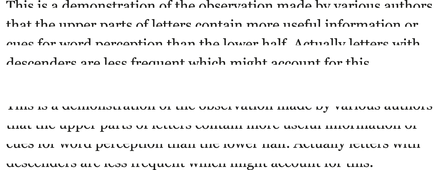
An effect which can be very easily demonstrated is the relative ease of reading text when only the top halves of letters are available compared with the bottom halves (Figure 5.18). This is obviously not a way in which we would set text, but it may tell us something about how we read, for example through eye movements. This knowledge may help us, perhaps indirectly, in making design decisions.
Huey (1908/1968) observed the advantage to perception of the upper half claiming that
…the upper half of a word or letter is obviously more important for perception than is the lower half. Huey (1968, p98)
This was explained in an early printers’ handbook Typographical
printing-surfaces: the technology and mechanism of their production by
Legros and Grant (1916) as more frequent letters projecting above the
middle line. Letter frequency counts can vary depending on how they have
been counted, what content is used, and the language. However, despite
differences the consensus is that the first letter with a descender (p
or g in English and probably p in Spanish) is number 16 in terms of
frequency; there are 4 or 5 letters with ascenders that are more
frequent than p. Logically, this tells us that there will be more
letter parts above the midline than below which can disambiguate the
letter. A comparison of the level of ambiguity in the lower and upper
part of letters across some European languages (Tejero, Perea, and Jiménez, 2014) shows similarities:
-
English: 68% of letters are ambiguous in lower part; 51% ambiguous in upper part
-
Spanish: 68% of letters ambiguous in lower part; 50% ambiguous in upper part
-
French: 68% of letters ambiguous in lower part; 50% ambiguous in upper part
By examining eye movements, we know that the eye fixates for longer when reading the lower half compared to the upper half, indicating that removing the upper half produces a greater cost to reading (Perea, 2012). The research described above which identified the features of letters we use to distinguish one letter from another did not find a bias towards features in the upper parts of letters. The bias we see in the demonstration (Figure 5.18) appears to be restricted to letters in the context of words. This is because words do not have equal numbers of each letter but have more letters that are ambiguous in their lower part (in the Latin alphabet). This is evidenced by a clever experiment which controlled the number of ambiguous letters in the top and bottom half of words and removed the effect (Tejero, Perea, and Jiménez, 2014).
Upper versus lower case
Unlike comparisons of different typefaces, a fairly consistent result is that all upper case (capitals) slows down reading compared with lower case or sentence case (where the beginnings of sentences are capitalised). In the past, this was attributed to the loss of word shape (ascenders and descenders) in upper case, but as we read by identifying individual letters, this cannot be the explanation. We are more familiar with reading lower case in continuous text which can account for this advantage. This explanation is proposed by a very recent study which found that when reading sentences, words in upper case were more likely to be re-fixated (looked at again) than words in lowercase (Perea, Rosa, and Marcet, 2017). The researchers suggest that we do an initial familiarity check before we move our eyes to the next location and this check is more likely to be a match with stored words if we are reading more familiar visual forms.
However, at the same point size, upper case is larger than lower case. Should the x-height of lower case be equal to the cap height when we make comparisons in experiments?
-
If lower case (bold) letters approximately match the x-heights of upper case (Figure 5.19), headlines are located faster in lower case (Poulton, 1967).
-
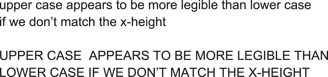
If we don’t adjust but compare Arial in the same point size for caps and lower case (Figure 5.20), upper case appears to be more legible (Arditi and Cho, 2007). This is logical as the upper case letters are larger. For readers with normal vision, reading is quicker for upper case when at acuity limits, but this advantage goes when using a larger size that is typical of regular reading conditions.
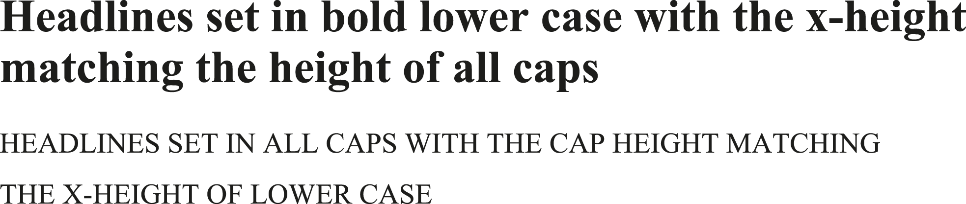
Figure 5.19: Comparison of text in Times New Roman 22.5 point bold and Times New Roman 14 point all capitals. The x-height of the upper examples matches the cap height of the lower example by adjusting the nominal point size. With this adjustment, headlines were found faster in bold lower case (Poulton, 1967).
All of this seems to point to the physical size of letters being important, as well as familiarity, i.e. what we are used to reading.
Question: Are you surprised by this?
Type size
If we remain at the level of letters, explaining legibility would seem to be very straightforward:
The size and shape of printed symbols determine the legibility of text.
Legge and Bigelow (2011, p1)
Shapes have been covered above in some detail and differences between upper and lower case led to the conclusion that size may be more relevant than shape.
One approach to finding out the most appropriate type size for reading continuous text is to determine limits. The smallest character size for which reading is possible at maximum speed is called ‘critical print size’. At sizes smaller than this, reading speed gets much slower. The critical print size depends on individuals, typefaces, and how you measure it. There is also the difficulty discussed above that typefaces of the same point size have different x-heights. Because the smallest or optimal point size for legibility will depend on the typeface, some research will be valid only for the particular typefaces used in the studies.
A way to resolve this issue may have emerged from the collaboration (mentioned previously) between the vision scientist and type designer (Legge and Bigelow, 2011). They take various past studies and translate the type sizes into measurements of the visual angles of the x-heights. To make this accessible to designers, they describe what this would mean in relation to a common typeface. They report that studies indicate that the critical print size is an x-height of 0.2 degrees which is equivalent to 9 point Times New Roman at a distance of 40 cm. This happens to be consistent with Tinker finding that 9 point Granjon was read as fast as larger sizes (Tinker, 1963, p71). This convergence of a minimum size for print is encouraging as different methods were used to come to the same conclusion making the result more reliable. However, a distinction should be made between the critical print size (minimum) and the size that optimises reading performance. Box 5.8 gives more details of the collaborative study.
On screen, a slightly larger size of 10 point seems to be required for ‘threshold legibility’, i.e. the smallest size that we can recognise letters and words. The importance of x-height in relation to body size was also found to be a factor in increasing legibility (Sheedy, Subbaram, Zimmerman and Hayes, 2005). For a given body size, Verdana was the most legible and Times New Roman the least legible, with Arial and Georgia intermediate in legibility (see Figure 5.22).
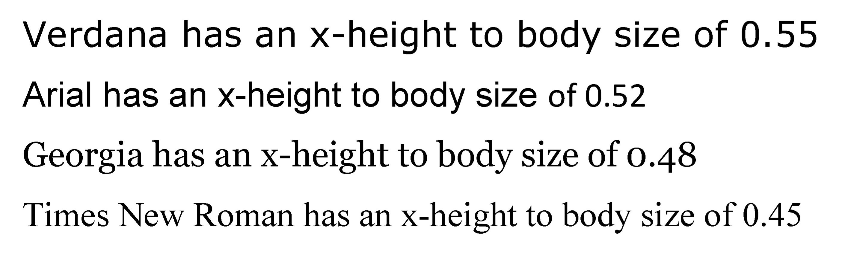
Figure 5.22: Relationship between x-height and body size (based on figures in Legge and Bigelow, 2011) which correspond to threshold legibility.
When speed of reading is measured, 12 point is read faster than 10 point, but the difference is relatively small. In this study by Bernard, Lida, Riley, Hackler, and Janzen (2002), the researchers found a trade-off between speed and accuracy: the slightly faster reading of 12 point resulted in missing some of the deliberate errors (substituted words) in the text. Some suggestion that there may be no advantage in going above 10 point on screen when using Helvetica and Georgia comes from an eye tracking study (Beymer, Russell, and Orton, 2008). But we must remember that the x-height of the typeface is likely to be the determining factor.
All of the above research relates to adults. Children’s reading books typically use larger type sizes and generous line spacing and these both reduce as reading age increases. The key is to ensure that differences among letters are easy to discriminate at early ages so that the child can focus on the other aspects of reading (deriving sound and meaning) rather than perceptual processing, i.e. identifying the letters.
Tinker (1965) proposed that by about 10 years old children respond to typographical arrangements in the same way as adults, therefore at that age between 10 and 12 point type would be suitable. Sizes recommended for younger children are:
-
between 14 to 18 point for 5–7 year olds
-
between 14 and 16 point for 7–9 year olds
-
about 12 point for 9–10 year olds
Question: Based on what you now know about how we read, can you suggest why it may not be a good idea to continue using larger sizes beyond about 10 years old?
Research seems to support the advantage of larger print for younger children and some researchers argue that type sizes in children’s reading schemes could be larger than are currently employed (Hughes and Wilkins, 2000).
Type variants (bold and italic)
Traditional research indicates that text set all in italics slows down reading; bold appears not to affect speed of reading continuous text and can be perceived at a greater distance (summarised in Tinker, 1963, 1965). Typical practice and recommendations from well-regarded typographic books such as The elements of typographic style (Bringhurst, 1992) is to use bold for setting titles, emphasising keywords etc., and to use italic as a means of differentiating words or sentences within longer paragraphs. These differentiations can be regarded as ‘typographic cueing’ which can work as an isolation effect, setting apart some information and making it more likely to be noticed by readers.
Looking at how quickly we can recognise a word (by saying whether it is a word or not a word — a non-word), bold words are responded to faster than roman (using Bookman and Arial typefaces). This is particularly the case if the word is uncommon (referred to as low frequency) (Macaya and Perea, 2014).
It may seem that it is a good idea to use a bold font for setting whole texts but some further evidence suggests that a distinction can be made between a font’s legibility and the perceptual salience of individual words (Dyson and Beier, 2016). This study explored switching between roman and different variants to see which stylistic features (weight, width, contrast, and italic) disrupt word recognition. We found that single bold words are perceptually salient (i.e. stand out), but are not particularly legible as a font. Switching from roman to italic, however, does not slow down word recognition and suggests that words set in italic will therefore not function as well as bold for emphasis. Bold seems to be more appropriate than italic for setting headings or other access devices through making words stand out.
Typeface semantics
In Chapter 1 the idea of a typeface having a semantic role, as well as a functional role, was introduced. Typefaces can be suited to particular purposes not only because they are easy to read, but also because they convey a meaning though their visual form, sometimes described as personality. This is particularly relevant to marketing where brand names in appropriate typefaces (i.e. consistent with the product) are chosen more often than inappropriate ones (e.g. Doyle and Bottomley, 2004, 2006).
These two roles appear to be quite separate. A specific typeface might be more or less appropriate for a particular context (e.g. shop sign, wedding invitation, novel, textbook, annual report) but why would the legibility of this typeface be affected by its personality? This separation between legibility and aesthetics may not exist according to a captivating study. This study shows that we respond to words more slowly if the perceptual qualities of the font are inconsistent with the meaning of the word, e.g. the word ‘heavy’ in a ‘light’ font (Lewis and Walker, 1989). Figure 5.23 illustrates words where the font is consistent or inconsistent with the meaning of the word. The origins of this effect are described in Box 5.9.
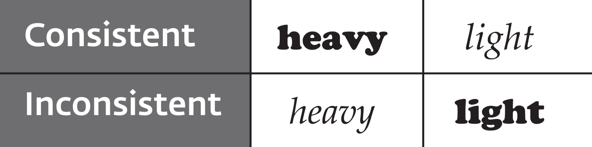
Figure 5.23: Two of the words used by Lewis and Walker (1989) set in Cooper Black (heavy) and Palatino Italic (light).
A more recent study confirms that using a font that is inconsistent with the word’s meaning (Figure 5.24) slows down decisions regarding the emotion conveyed (Hazlett, Larson, Shaikh, and Chaparro, 2013). Therefore, legibility can be influenced by the meaning conveyed by the typeface, although there does need to be quite a big difference between the personalities of the typefaces for this to emerge.
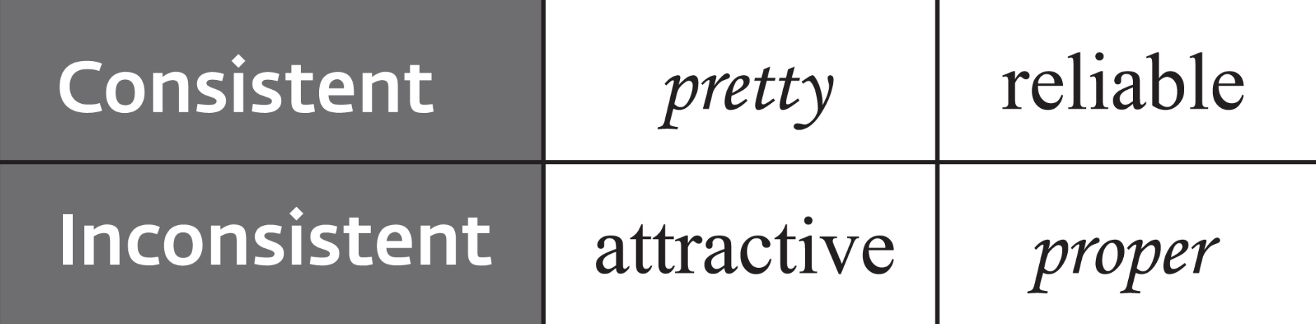
Figure 5.24: Four of the words used by Hazlett, Larson, Shaikh, and Chaparro (2013) set in Corsiva and Times New Roman.
Early studies described the connotations of typefaces as atmosphere value (Ovink, 1938) and congeniality (Zachrisson, 1970). The experimental approaches to determining the meaning have usually used semantic differential scales (see description of Rating in Panel 4.5). The dimensions that have emerged are:
-
Evaluative measuring the value or worth of items (e.g. good versus bad; beautiful versus ugly)
-
Potency measuring the strength (e.g. strong versus weak)
-
Activity measuring action (e.g. active versus passive; fast versus slow)
-
Mood measuring happiness (e.g. happy versus sad; relaxed versus tense)
The first three dimensions apply to many different types of things, e.g. political parties or works of art, but mood has been found to be particularly relevant to typefaces.
As typeface preferences and use change over time, it may be more helpful to look at results from studies in terms of more general patterns rather than the personalities of specific typefaces. Shaikh and Chaparro (2016) report an online survey of 40 on-screen typefaces with trends showing:
-
Display typefaces that are bold, dark, block-like are viewed as stronger, less valuable, and more active (Broadway, Agency, Playbill)
-
Script typefaces are seen as less strong, more valuable, and less active (Vivaldi, French Script, Monotype Corsiva)
But we should note that there are also individual typefaces within a category that deviate from these trends. Figure 5.26 illustrates the typefaces.
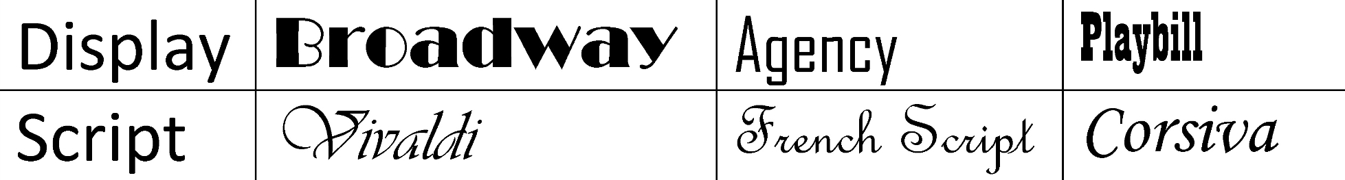
Figure 5.26: Display typefaces viewed as stronger, less valuable, and more active. Script typefaces viewed as less strong, more valuable, and less active (Shaikh and Chaparro, 2016).
As we normally focus on reading, rather than examining the typeface, we may not be conscious of typeface connotations. But if asked to judge the appropriateness of a typeface for a particular type of text (e.g. professional or friendly), readers are aware of consistencies or inconsistencies (Brumberger, 2003).
We might expect typographers and graphic designers to be rather more focused on the personality of typefaces. A couple of studies have found some differences as to how the semantic qualities of typefaces are perceived based on the level of experience of design, but non-designers are able to perceive typeface connotations (Tannenbaum, Jacobson, and Norris, 1964). There is quite a lot of agreement between designers and non-designers but there can also be pronounced differences on specific typefaces (Bartram, 1982). For example, designers rate Futura as positive on the Evaluative and Mood dimensions (e.g. beautiful, pleasant, good, happy, relaxed) whereas non-designers rate Futura as negative on these same dimensions (e.g. ugly, unpleasant, bad, sad, tense). Some caution should therefore be taken in assuming that your own perceptions will be a perfect match with all readers’ perceptions.
Question: How would you go about checking that your choice of typeface(s) for a project is perceived as appropriate by the readers?
Rather than determining the meaning of a typeface directly, a few studies have looked at how the content of a text may be influenced by the typeface. Satirical articles on government issues and education policy set in Times New Roman were perceived as more satirical (angry and funny) than the same texts in Arial (Juni and Gross, 2008). However, this was not a very strong effect and an earlier study failed to show that the typeface can influence how the text content was perceived (Brumberger, 2003).
In the context of a job application, consideration should be given to the choice of typeface. Three identical resumés (CVs) set in three different typefaces (see Figure 5.27) can affect how an applicant is perceived (Shaikh and Fox, 2008).

Figure 5.27: The three typefaces used for CVs (Shaikh and Fox, 2008)
Question: Would you use any of these typefaces for your CV? If not, why not? Which of these typefaces would lead you to judge an applicant as knowledgeable, mature, experienced, professional, believable, and trustworthy?
Despite the relevance of typeface connotations to choosing a typeface for a specific purpose, legibility is more important as a criterion of appropriateness than consistency for text-heavy document types (Shaikh and Chaparro, 2016). Readers are aware of the value of ease of reading.
Summary
This chapter focuses on type which can make it seem the most important aspect of legibility. It is significant because reading starts with identifying letters. However, we should not forget that the way in which typographic and graphic designers use type is crucially important to ease of reading. The next chapter addresses this, looking at research on typography.